


1940 Armistice Day Storm:
Climate
Introduction
Single severe weather events cannot be used in isolation to describe a region's climate. Data collected over a long time period works to average out unusual events like the Armistice Day Storm. This lesson details how students can use data to describe their region's climate and depict it graphically.
Focus Questions
What are the key ways in which to calculate a region's climate?
How can climate data be depicted?
Learning Objectives
- To understand the difference between weather and climate.
- To understand and compute temperature mean, median, quartiles, climate variation, and create box plots and histograms that demonstrate this understanding.
Preparing to Teach this Lesson
Weather refers to the short-term variations in the state of the atmosphere at any particular time and location. Long-term variation in the state of the atmosphere at any particular time and location is called climate. Another way to say this is that climate is a representation of a region’s weather over a given period of time. A region's climate is often characterized by the average and variation of the climate system over periods of a month or more. This data is typically gathered over a period of many decades, and can be used to describe a region’s weather patterns.
Suggested Activities
Temperature: Finding the Mean
Temperature is a very important component of climate data. Many people who record temperature do so every hour of everyday for a certain location. There are two ways you can teach your students to calculate the daily mean. The first way works only if you have access to hourly temperature records. If this is the case, have your students add each hour’s temperature together, then divide the sum by 24. The second way is often the easier and more common way to calculate the daily mean. Simply have your students add the daily maximum and minimum temperatures together and then divide the sum by two.
If you do have access to hourly temperature records for a given day, have your students compute the mean both ways. Compare the results. If the two temperature means are different, have your students suggest reasons why. Then discuss which calculation may be more accurate, and why.
Temperature: the Monthly Mean
The monthly mean is easy to calculate once you know the daily averages for each day of a month. Have your students record the daily mean temperature for a given month. Then have them find the monthly mean by adding daily means and dividing the sum by the number of days in the month.
Go to the website of the Wisconsin State Climatology Office. Find the monthly mean temperature for your area, averaged from 1971 to 2000, by clicking on “Normal Climate by Location.” Next click on your city, or a city near you. Click “Temperature” and look up the mean temperature for your particular month. Have your students compare the 30-year mean with the monthly they just calculated. Discuss the results! If there is a difference in the two means, have your students suggest reasons why this particular month was abnormal.
The Importance of Time Periods
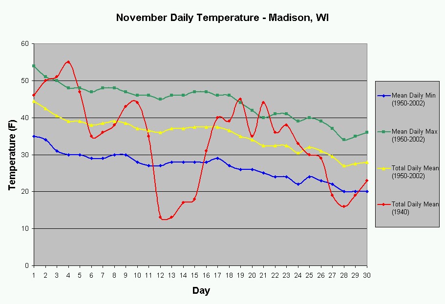
It is very important that data has been collected over a long range of time when studying climate. Your students may have discovered that their monthly mean from the previous exercise was different from the 30-year monthly mean. To help your students understand why data must be averaged over several decades, refer to the following figure of the November Daily Temperature graph of Madison, or go to the Wisconsin State Climatology Office to get a another city close to you.
As you can see, November 1940 was an extremely abnormal month in terms of temperature because of the Armistice Day Storm on the 11th. Since months like this are not common, we must average as many months as we can in order to get a more accurate description of a region’s typical climate.
To help your students understand this on their own, have them examine this graph. Compare the line plot for November 1940 with that of November 1950-2002. Discuss the differences and/or similarities between the two. Now let your students explain why we must average data over many years.
Temperature: Finding the Median and the Quartiles
To find the median temperature for a month, have your students arrange the average temperatures in order from coldest to warmest. For an odd number of days, the median is simply the middle temperature. For an even number of days, the median is the average of the two temperatures that split the center. The median is also defined as the 2nd quartile (50th percentile).
You can teach your students how to find the 1st and 3rd quartiles (25th and 75th percentiles, respectively), as well. To find the first quartile (Q1) and the third quartile (Q3) simply have your students multiply the number of days in that particular month with either 0.25 or 0.75, respectively. If the product is not a whole number, then always have the students round up to the next integer. Finally, with the data still arranged in ascending order, find the value that corresponds to the product your students calculated. For example, if your students are trying to find the first quartile for November, they would multiply 0.25 by 30. Since the product is 7.5, they must round up to 8. Now they will need to find the 8th coldest value to get the first quartile. If the product is a whole number, find both the value that corresponds to it, and the next warmest value. In this case, the average of the two values is the first quartile. Follow the same procedure for the third quartile.
Climate Variation
Often times, the values for a particular region’s average temperature and precipitation may prove misleading when used as a description of climate. Two cities may have nearly identical temperature and precipitation averages, or means, yet have vastly different weather patterns. For example, one city may not experience large changes in season and have temperatures close to 50 degrees F all year long. A second city may experience temperatures around 30 degrees F in the winter and 70 degrees F in the summer. However, when the daily temperatures are averaged, both cities will have nearly the same mean temperature of 50 degrees! Likewise, precipitation for one city may be evenly spread out over the year while another city may experience individual dry and wet seasons over the same time period. Both cities may end up having similar precipitation averages. The figure below depicts such a case.
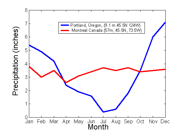
Figure 1: Monthly average precipitation amounts for Montreal, Canada and Portland, Oregon, USA. The total average monthly precipitation amounts for these two cities are: 3.4 inches for Montreal, and 3.32 inches for Portland. However, it is obvious from the figure that the cities have very different climates.
Creating a Histogram to Describe Statistical Data
Histograms are a great way to graph data. Have your students again arrange their data in ascending order. Now they must come up with a set class interval to group their data. The size of the class interval depends on the range of data. For example, if the values range from 21 to 30, the students may want to use an interval of 2. Therefore the classes are: (20 – 22], (22 – 24], (24 – 26], (26 – 28] and (28 – 30]. Now let’s say the values range from 21 to 50. In this case, the students will want to use a larger class interval. Once the students have decided on an interval, have them create their classes, as in the example above. Next, the students will need to count how many of their values fall within each class. This is also known as the “number of occurrences” or the “frequency” of a particular class.
To create the histogram, have the students first label the classes on the x-axis, and the number of occurrences on the y-axis. Next, have the students create rectangular bars for each class. The widths of the bars are equal to the size of the class interval, and the heights are equal to the number of occurrences in each class. Leave no space between the bars.
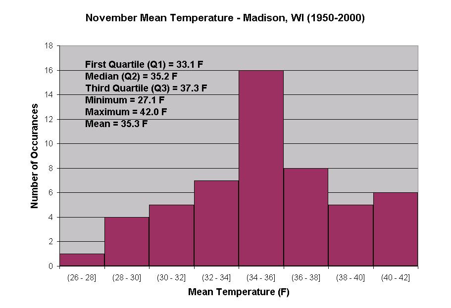
You may also have your students find the mean, median, maximum, minimum and the quartiles. Have them write the values on their graph, so they are able to see how the histogram depicts their data. The figure below is an example of a histogram.
Click for larger version
Figure 2: November monthly mean temperature for Madison, Wisconsin averaged from 1950 to 2000.
Creating a Box Plot to Show Variation
As you can see, to get an accurate picture of climate, we must sometimes go beyond averages. One way your students can do this is to create a box plot to characterize the variation in data, like temperature and precipitation. First, have the students make a scale, by drawing a horizontal line and numbering it to best fit the data range. Find the minimum value and draw a dot above it on the scale. Be sure they label it! Do the same for the maximum value as well as the values they calculated for Q1, Q2 (median) and Q3. Next, make a box by drawing two vertical lines through the dots for Q1 and Q3, then connecting the top and bottom with horizontal lines. Place a vertical line through Q2, as well. Finish the plot by drawing horizontal lines from the minimum and maximum to Q1 and Q3, respectively. This box allows the students to visually depict where the central tendency is for their data. An example of what a box plot should look like is depicted in the figure below.
Minimum: 13 F
First Quartile (Q1): 23 F
Median (Q2): 35.5 F
Third Quartile (Q3): 44 F
Maximum: 55 F
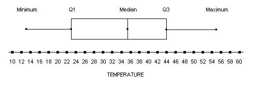
Figure 3: Box plot of daily mean temperature in degrees Fahrenheit (F) for November 1940, Madison, Wisconsin.
Retrieving Information from the National Climatic Data Center
It is often useful to access Wisconsin’s climate data from the National Climatic Data Center (NCDC) . Once at the homepage, click on “Weather Station/City.” Select “State” and type “WI” in the search box. Click on the station you’d like to retrieve information from. (Keep in mind that this online data is a work in progress, so some stations may not have the data you are looking for). Next, click on “Data” on the right-hand side of the page. Go to “Digital ASCII Files.” For daily data click on “Daily Surface Data.” For monthly information, click on “Summary of the Month.” (If you choose “Daily Surface Data,” you will want to “Continue With ADVANCED Options”).
A box will come up, and you may choose the weather elements you wish to receive, as well as the preferred range of time. It is best to select “Delimited – No Station Names” and “Space, without data flags,” for the Output Format. Hit “Continue.” To get this data free of charge, you will need to provide a valid ‘edu’ email address before you submit your request. Next, click on the URL at the bottom of the page to access your files. Your requested information can be found in the “Data File.” If you are not familiar with the format of this data, then refer to the “US Format Documentation” for explanations.
Assessments
1) Discuss as a class why a single severe weather event, like the Armistice Day storm, may or may not be used as evidence of a changing climate.
2) Examine the graphs of November Daily Mean Temperatures of 1950-2002 vs. 1940. Now revisit the previous discussion. Why is it important that daily means be calculated over a large time period?
3) Examine the graphs of Mean November Temperatures (1950-2002) for one of the cities on the web page, or compute your own graph. After learning the mean temperature for November 1940, does it appear that this particular month was an extreme? Why or why not? Do you think the Armistice Day storm had an impact on long-range climate change? How do the mean temperatures align with the upper and lower quartiles?
Extension Activities
Climate Variation (for spring classes): Finding the median and quartiles; Creating a box plot
Step 1. Have your students find the daily mean temperatures for a particular month. From the data they record, have them calculate the median, and the first and third quartiles. Have the students identify the maximum and minimum values as well, and then tell them to calculate the range and the interquartile range. Also, have them identify the mode of their data set.
Step 2. Now that your students have found the maximum, minimum, 1st, 2nd and 3rd quartiles, you can easily make a box plot to characterize the variation in temperatures. Discuss the results you found for your month. Have your students calculate the monthly mean and compare it to the median. Are they similar or different? In what cases may the mean be more accurate, and in what cases may the median be more accurate in measuring the central tendency of data?
Climate Variation (for fall classes): November daily and monthly mean temperature
Do it yourself! Record the maximum and minimum temperatures for each day of this current year's November month. Be sure to get your temperatures from the same source everyday; this will help maintain accuracy. Once you have all of your temperatures recorded, find the daily mean temperatures. Do this by adding the maximum and minimum together, then dividing that answer by two. You can also find the monthly mean temperature by adding all of the daily means together and dividing by 30. Plot the daily means on a graph with the day on the x-axis and the temperature on the y-axis. Compare this particular month to that of 1940 on one of the graphs for a city near you. What differences and similarities do you see?

