


Creating a Histogram to Describe Statistical Data
Histograms are a great way to graph data. Arrange yourr data in ascending
order. Now determine a set
class interval to group your data. The size of the class interval
depends on the range of data. For example, if the values range from 21
to 30, the students may want to use an interval of 2. Therefore the
classes are: (20 – 22], (22 – 24], (24 – 26], (26 – 28]
and (28 – 30].
Now let’s say the values range from 21 to 50. In this case, tyou will want
to use a larger class interval. One rule of thumb is to set the number of intervals
to
twice
the cube root of the number of observations. In the case of 1000 observations,
this
rule yields 20 intervals (2*10). Once you've decided on an interval, count how
many of their
values fall within each class. This is also known as the “number of
occurrences” or the “frequency” of a particular class.
To create the histogram, first label the classes on the x-axis, and the number of occurrences on the y-axis. Next, create rectangular bars for each class. The widths of the bars are equal to the size of the class interval, and the heights are equal to the number of occurrences in each class. Leave no space between the bars.
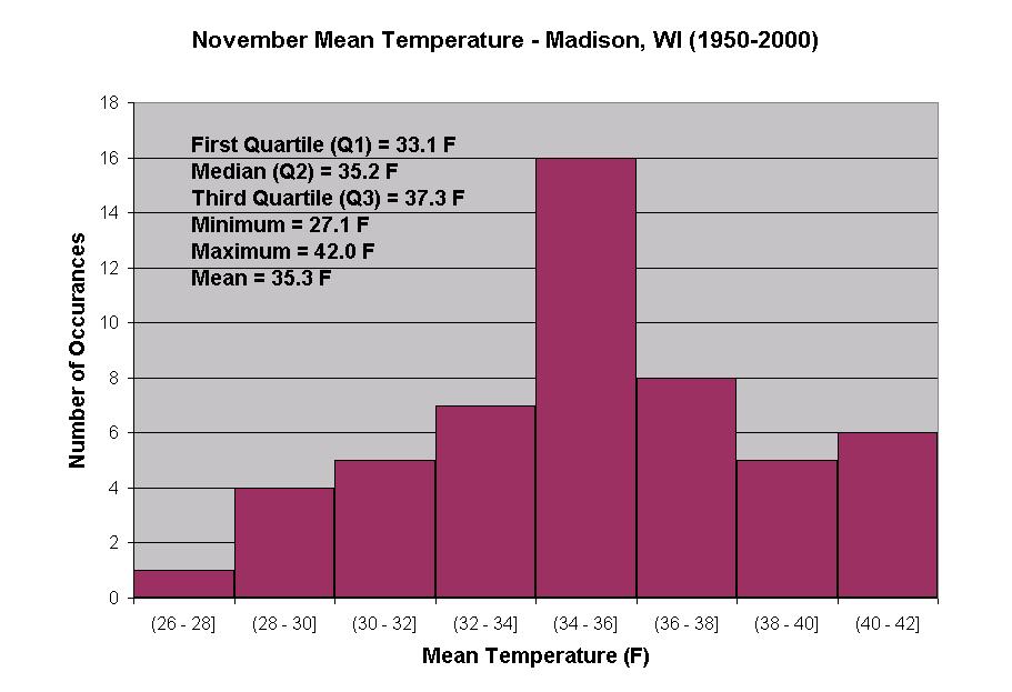
You may also have to find the mean, median, maximum, and minimu. Write the values on their graph, so you can see how the histogram depicts the data. The figure below is an example of a histogram.
Click for larger version
Figure: November monthly mean temperature for Madison, WI,
averaged from 1950 to 2000.

